Design systems are all the rage these days. We know that it’s worth the time and effort to create a design system as a single source of truth for all things UX design related. But how does a sole UX practitioner do this for a smaller firm that’s going through a transition?
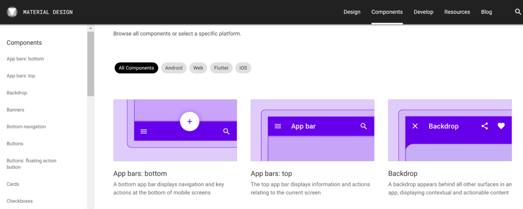
It’s important to start somewhere, knowing that things will change. It’s totally fine to use an existing design system and customize it as needed. For example, Material Design system is a good place to start since it has most of what you need and it’s a well conceived and maintained system.
Getting Started
I try not to tell people which design app to use since most people will insist that whatever they’re using is the best. I like to say that I’m tool-agnostic, meaning that I will use whatever tool is available to me, or the tool that the organization I work for has decided to use. All design apps have their pros and cons… Anyway the good news is that Material Design is available for the most popular design apps.

There are plenty of tutorials out there for how to customize the colors, type and style elements. Right out of the box, you’ll have a nice library of components to get you started. It will be important to set up your design system in a way that it’s easy to distribute changes across all of the components that are affected. Think about the way we use CSS stylesheets to determine the style rules across an entire website.
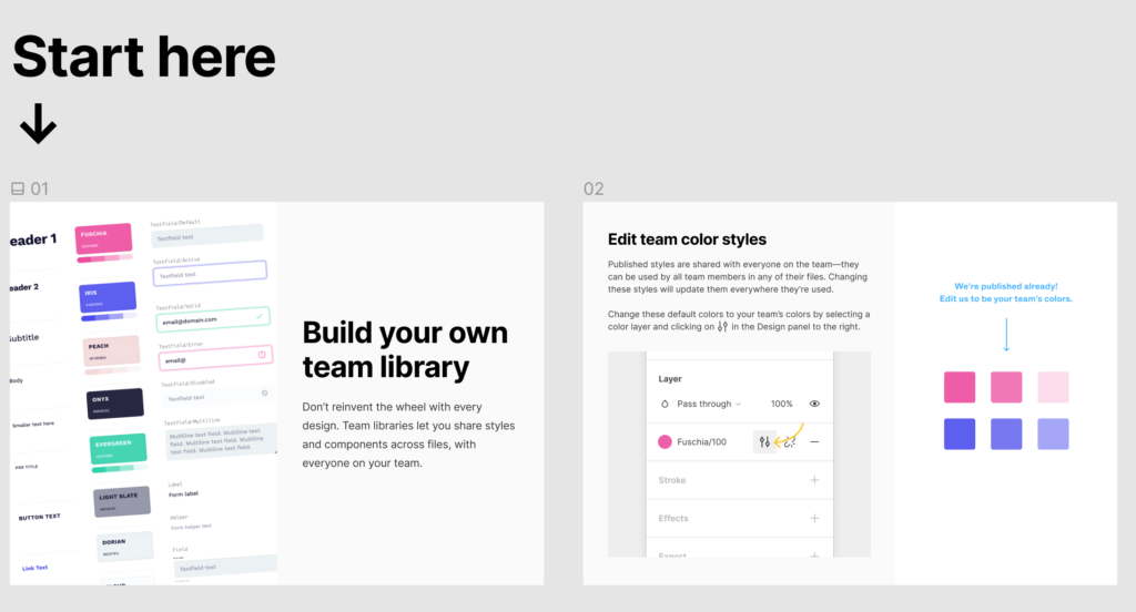
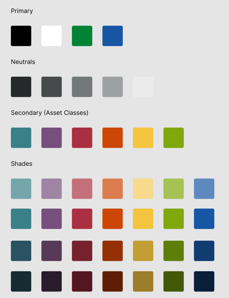
For some scenarios, you may need to create different libraries/styles for different projects, especially you’re working for different clients. Spending a little time setting things up can save you a lot of effort later. Figma recommends setting up teams and provides templates and instructions for how to get started (above). One of the first steps is to set up your color palette. Doing this right from the start makes life a lot easier as your project grows.
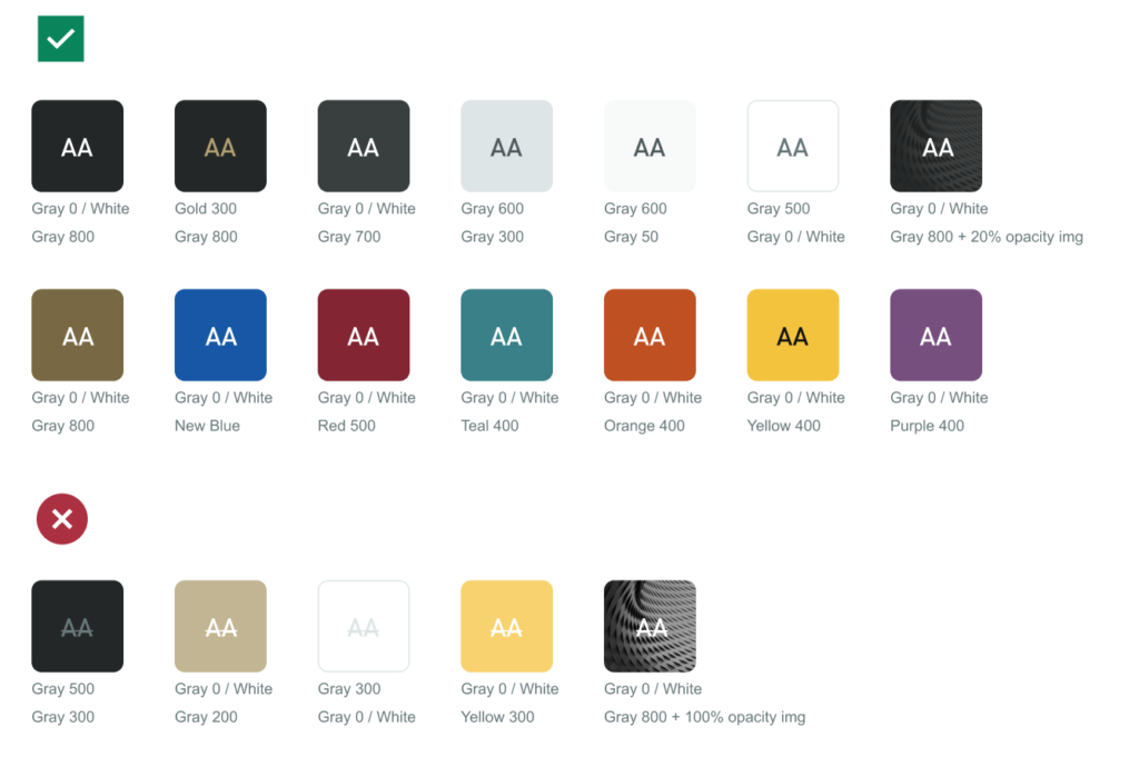
It’s also important to think about color contrast for accessibility. in the second example above, you can see that the top set of colors with contrasting text will pass an accessibility color contrast test, whereas the ones below fail. There are a number of tools to check color contrast to ensure your text/background color combinations pass an accessibility test. WebAim is easy to use.
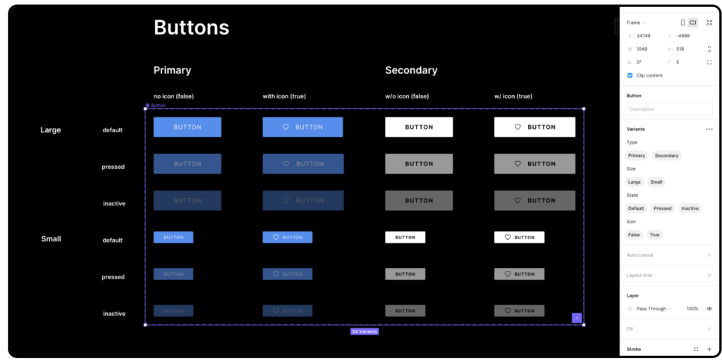
Starting with the most basic set of components allows you to build your library in a modular fashion, ensuring a unified look and feel throughout your project. When you make adjustments to components, they should be updated across all connected instances. You can also create variants of components and group them together for more flexibility. It’s a good idea to take the guesswork out of your design system without having to create a component for every possible combination of properties and values.
Conclusion
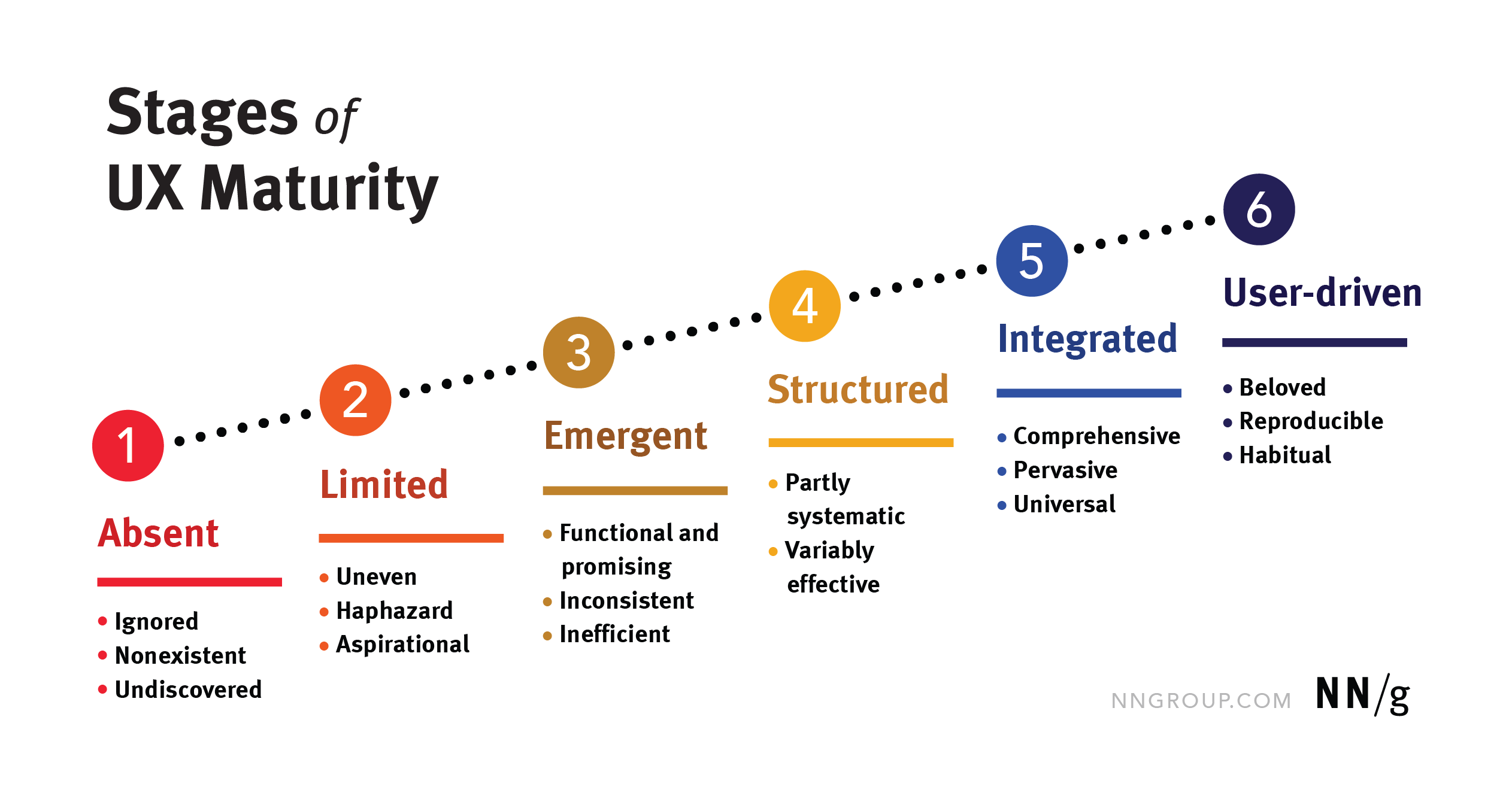
Without getting too deep into the complexities of creating a full-fledged design system, it’s not too difficult to get started on the right foot. The goal is to make life easier for everyone, including other designers, and developers and of course, users. The goal is to move towards greater UX maturity, as eloquently described by Nielsen Norman Group:
“UX maturity measures an organization’s desire and ability to successfully deliver user-centered design. It encompasses the quality and consistency of research and design processes, resources, tools, and operations, as well as the organization’s propensity to support and strengthen UX now and in the future, through its leadership, workforce, and culture.”
–https://www.nngroup.com/Nielsen Norman Group
